3.2 Graph Crimes
Contents
3.2 Graph Crimes#
Example 1#
What’s wrong with this graph?

Suggested reasons
The x-axis does not start at zero, so it greatly exaggerates the difference between countries.
We are not given any uncertainties, so we cannot tell how confident we should be in the differences between countries.
Example 2#
What’s wrong with this graph?

Suggested reasons
The x-axis scale suddenly changes from linear to logarithmic. This creates the impression that growth among the top income brackets is spread across a much wider range than it actually is. We should actually see more of a sharp increase for a very small fraction of the population.
The grid lines add to this impression, as they are spaced out in a way that makes the scale is uniformly spaced.
Example 3#
What’s wrong with this figure?
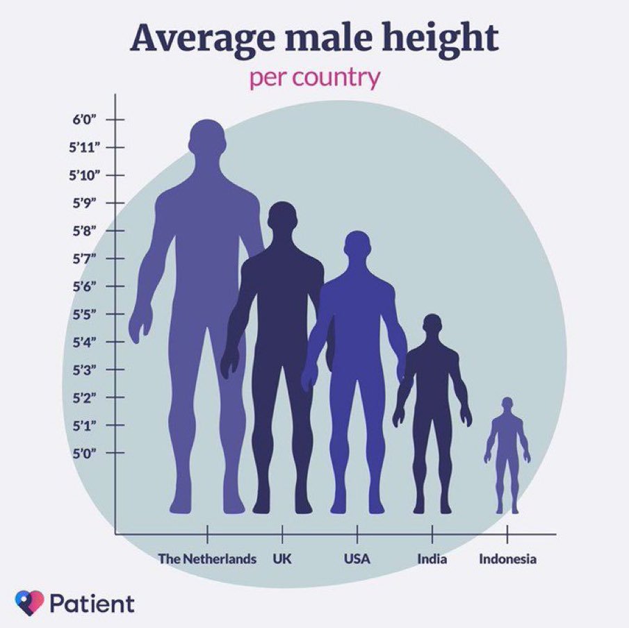
Suggested reasons
The scale of the humans is misleading.
Example 4#
What’s wrong with this figure?

Suggested reasons
There is too much information. It is difficult to understand the main points the figure is aiming to convey.
Example 5#
What’s wrong with this figure?

Suggested reasons
The use of a line graph is misleading. The data is actually categorical, so a bar chart would be more appropriate.
The y-axis is not labelled. We can’t tell immediately what the axes are.
The x-axis is confusing. There is too much precision in the numbers, and they should not be evenly spaced.
The font is hard to read.
You can find more examples of bad graphs at @graphcrimes.